An Insider’s Guide to Mobile App Design
In my 4 years of experience in UI/UX industry, I realized that designing world has changed a lot since the day I started. Project after Project, I encountered new trends and strategies that turned the journey as if I’m on a rollercoaster. Many new app design techniques and tools emerged out to help to build masterpieces that are easy to digest and deliver to clients. However, one thing that stayed same even in the mid of so many revolutions is the process of creating an app.
Though various new terminology has come into existence and new job titles have been introduced to revamp the design realm. But, at its core, the app design process is still the same.
Different Phases of Mobile App Design
Get to Know about App
The very first phase of app design process is to gather extensive information about the app project. When both the design team and client come to the table to discuss the app idea, it becomes easier for both the ends to come to a single output. In other words, the app is designed as per the client’s expectations.
The app discovery phase, from a designer point of view, mainly covers the following elements:
- Scope of app idea
- Target Audience
- Budget and Timelines for the Project
- Prime Functionality and Features
- Potential technologies to Use
- Future Goals
When designers get knowledge about the above-mentioned factors, they begin to brainstorm and visualize the design that goes with app project’s objective as well as market trends. While it might seem easy as you can be as creative as you want, the designers have to do extensive market research to understand the user taste and choose the right colors, fonts and typography for building an emotional connection. Besides, they have to set priorities for different elements during this phase, while inspecting elements that could distract users from the prime functionality of the app.
Make a Blueprint
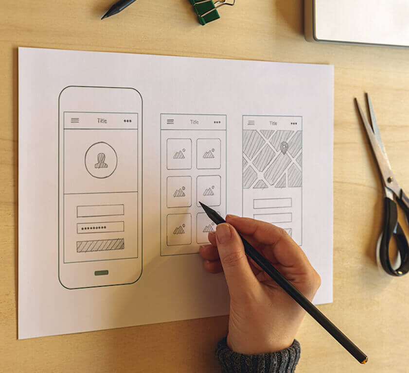
The next phase is to pen down your imagination on a paper in the form of a rough sketch. When the designers build a design sketch describing the app look and flow, they come across various ways to achieve the same.

These sketches are then compared and refined to discover which app layout is simple, interactive, depicts the brand’s story as well as go with the user needs. In short, this helps to decide which layout is perfect to go with.
Create a Wireframe
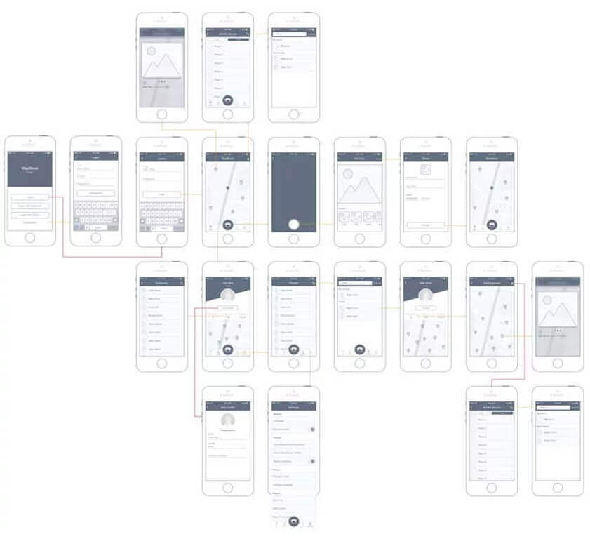
A wireframe, in a layman’s language, is a visual representation of the interactive designed crafted above, provided only the main elements are taken into consideration. It is the process of deciding which interface element will appear on the main page, based on the priority and interactivity of the design. While many people use Sketch or Omnigraffle, we still rely on Photoshop to build wireframes.

This phase holds immense importance to validate the idea from the design point of view and making the client get a clarity of the idea, who approach the mobile app development companies with the urge to ride in the uprising Uber for X wave.
Build a Prototype
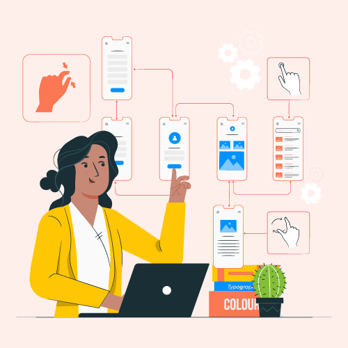
With a rough sketch of the app and wireframe in hand, the next phase is to create a prototype of the mobile application. It includes everything from a simple sketch of the app project interface to the dynamic interactive model.
The main goal of this phase is to simulate the final app project that enables them to test the design approach before investing valuable time in the development of the same. While some people use tools like Marvel and Invision to convert low-fidelity mockups into interactive mobile applications, others go directly for a native prototype written in Swift.
Go for Visual Design
This mobile application design phase focuses on the app appearance. It ensures that the app design is not only lucrative but also consistent, functional and identifiable via visual language. This phase brings the storytelling feature of the design in front and deals with challenges that come across to make the customer experience enjoyable and adding value to the brand. Based on the earlier design stages, it maintains the overall essence of the idea, goals defined in the app specification, flows formed in the wireframes, and the knowledge gained from the prototype.
Visual design, in layman’s terms, is the visual framework used to create a comprehensible, storytelling experience. It is the design that elevates the functionality of the app without letting people get bored or unclear about its functioning. In this stage of product design solutions, a designer has to follow a set of rules, conventions, and expressions that iOS and Android platform has already established related to UI components, coloured navbar and other minute customizations.
[Just in case you are curious to understand the role of a product designer in app development process, refer to this blog.]
I often begin visual designing with a UI kit as it empowers me to lean on Android and iOS conventions while experimenting with the layout in meaningful ways.
Invest in Development
The development stage begins after or many times, alongside the visual design stage. According to me, the person responsible for developing should be in coordination with someone belonging to the previous all phases as this will enable him to learn from the challenges faced earlier and put out more creative and functional piece of art. In other words, the design and development team should be in sync to build the right interactive product.
Iterate Your Mobility Solution

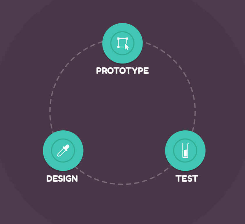
No right product can be delivered in one try. The changing mobile app design trends, user preferences, emerging technologies, and other factors make it usual for a designing team to iterate their design repeatedly to make your mobility solution more market-fit. But this doesn’t mean it would be like a relay race in a circular track.
This is just an abbreviated version of every stage of the mobile app design process. To get a comprehensive detail or get your mobile app designed by us, contact our team today.

strategies your digital product..


