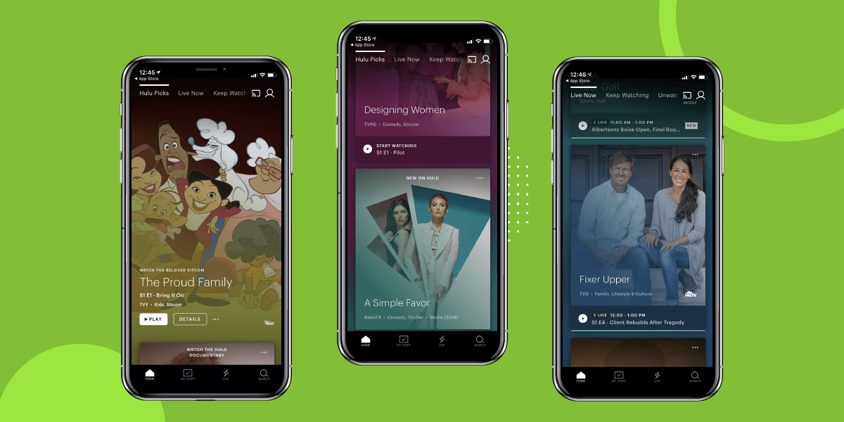
Hulu Rolls Out Redesigned UI on Android and iOS Platforms
Hulu, one of the popular media streaming apps, has pushed out a revamped user interface for its Android and iOS application.
The redesigned UI update, as announced back in CES 2019, comes up with removal of “Lineup” section, which video streaming app felt was very confusing to interact with.
“Lineup is confusing,” said Jim Denney, VP of Product at Hulu, “ Lineup, the way it is today, is a combination of editorial picks and recommendations…that combination of things is not as effective as we’d like it to be,”.
The team, with an intent to simplify the interaction, replaced ‘Lineup’ with two different sections – “Hulu Picks” and “Unwatched in My Stuff” collection.
The former is curated by the staff with the aim to have a control over what kind of content are offered as suggestions to the users. Whereas, the latter showcases the content picked as per users’ viewing history which is yet to be watched.
While there will still be one content at the focus of the screen, it will be much easier to see the other content on the same screen by scrolling down. What this change entails is that the smartphone users will be able to view two content cards on one screen and the iPad users would see two rows: six cards on the app’s main screen.
This format will be applied to all the tabs, besides ‘Keep Watching’ and is seen as a great method to improve the discoverability on the app with less swipes. And eventually, encourage them to spend more time on the platform.
Additionally, the team also shared various minor changes they have introduced in the user interface. Those included offering an option to mark content as “unwatched” and adding more content in metadata next to every content, along with providing information like genre, rating, and the year of creation.
But, what instigated this redesign? The answer is the same as why businesses take steps to redesign an app.
As the world is slowly and gradually realizing the role of media streaming apps in the entertainment industry, the competition is getting stiff. Apps like Netflix and Amazon Prime are coming up with better content and services, making users stick to their platform.
Amidst this competition, Hulu is still struggling with keeping users hooked to its platform for long durations. As revealed by the Hulu team, users are currently exiting the app within 30-60 seconds due to confusion of what action to take and how.
Since landing page is the first window users interacts with and is one of the biggest drivers of app discovery and revenue strategy, the Hulu team decided to give a tweak to its existing app UI design. They introduced a series of changes in its user interface to encourage users interact with their platform for longer.
Now, as we have seen what made Hulu roll out a design update on Android and iOS and the set of new features coming, the next question that arises here is: Will this redesigned UI/UX design improve the app discoverability and other KPIs?
Though there’s no surety, it has been seen that a change in UI/UX design often brings a momentous change in the app success numbers. And the best live example of this is Domino’s.
The application saw a rise in its conversion numbers by 23% with a refined UX design. Something that gives a hope that Hulu might also see a drastic difference in its numbers with an updated UI design.
The update is currently being rolled out on Android and iOS devices. But, it is expected to be pushed out on other platforms as well in the future.

strategies your digital product..


