How to Design Accessibility App for Visually Impaired?
Till a few years back there were around 285 million visually impaired people in the world, a number that is now growing and is expected to reach 115 million by 2050.
According to WHO, Globally, at least 2.2 billion people have a near or distance vision impairment. In at least 1 billion – or almost half – of these cases, vision impairment could have been prevented or has yet to be addressed.
On one hand, while the number of visual impairment is on a rise in this colorful world, on the other, technology has made a series of advancements to impart all the possible visual abilities to the impaired. This is so because there should be no difference in the digital experience that someone with a perfect vision and those who are challenged on the front encounters.
However, if you look at the time that has gone by, while it is impossible to argue that revolutionary work has been done to make the visually impaired independent (such as voice-based user interfaces), the grim side of it all remains – out of all the mobile app user demographics, visually impaired are the ones that are rarely planned for (if at all brought out of the backseat).
But when you too, like those technologists who work at making the digital experience similar for both the user set, look for the design accessibility apps for visually impaired holistically, what you are likely to find a promising scenario. A situation suggesting that designing accessible app design for visually impaired is not just a humanitarian move but also your ticket to reaching that number – 285 million user base.
For those of you who are still sitting on the edge on whether or not to invest in accessibility apps development or if you are still unsure on the clarity if at all your user base is made up of any share of the visually impaired population, let us concur here that there are in fact ways to make your app accessible without having to ignore the 70% of world’s population.
In this article, we are going to look at the different ways you can inculcate accessibility in your app design to impart a memorable user experience to the millions of people suffering from visual impairments in the world.
But before we head there, let us step into the shoes of the visually impaired and see what they see.
Colour Blindness

The concept of color blindness does not automatically mean a situation where visual impairment sufferers see things in black and white. In most cases, users simply confuse one color with another for they cannot see any difference.
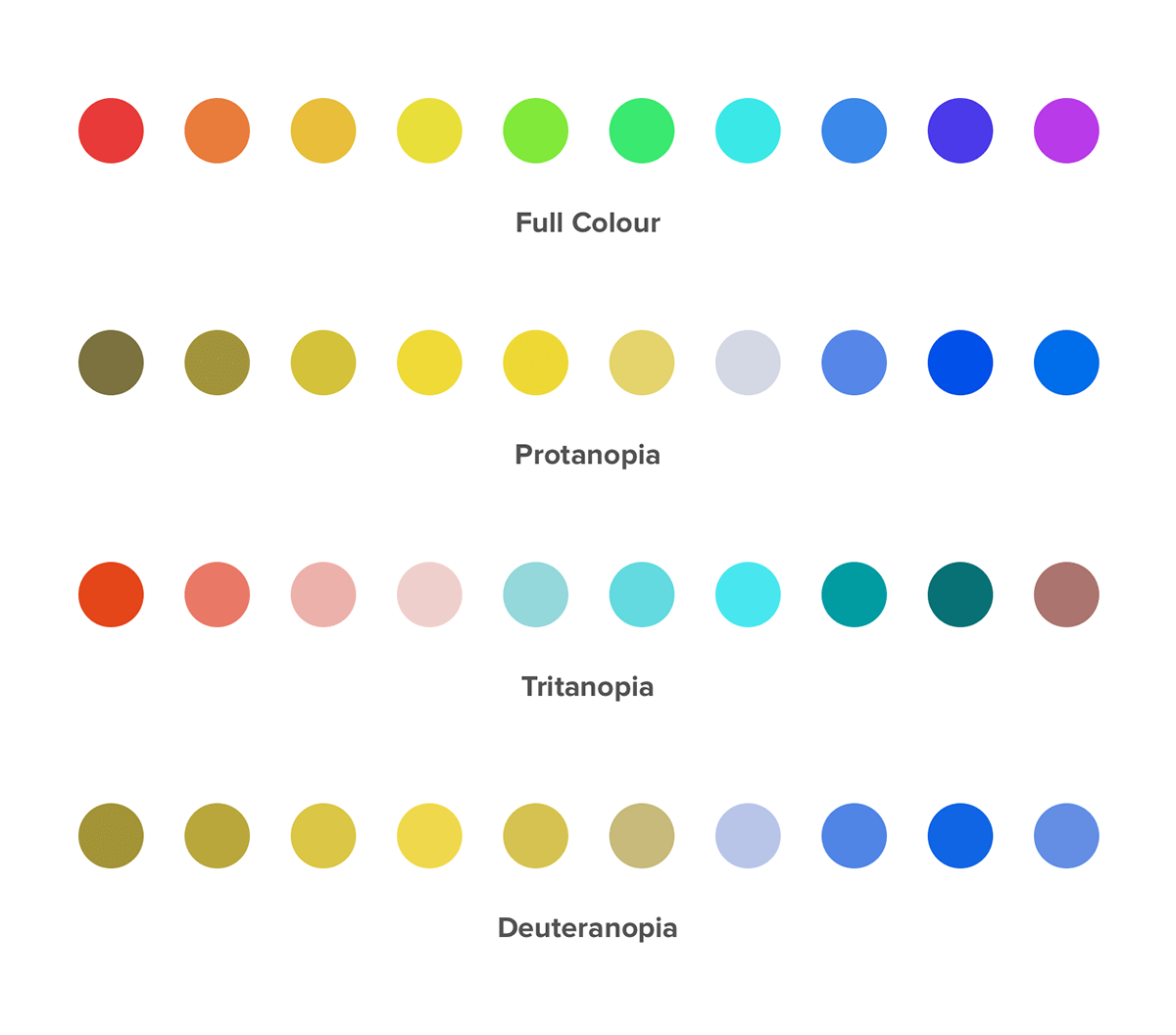
Apart from color blindness, a disease that every 1 in 12 men and 1 in 200 women have in the world, there are a number of visual impairment challenges that you will have to attend to when you work on accessibility app development.
Let us now show you what different visually impaired people see by making you visually impaired for the next 2 minutes through the help of NoCoffee Vision Simulator Chrome Extension.
Here is what the Appinventiv site looks like to a normal vision user
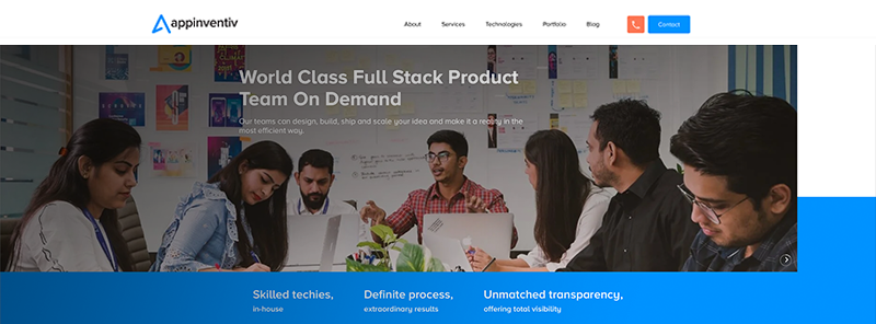
To someone with loss of acuity, the site looks like this

To someone having a peripheral vision, the site looks like this
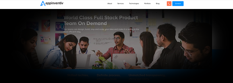
To someone who has ghosting vision, the site looks like this

To someone who sees large spots, the site looks like this
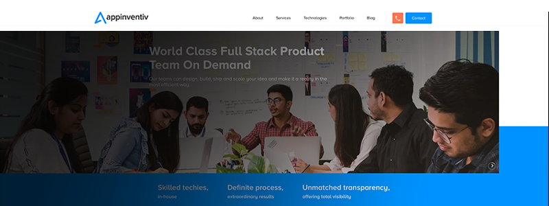
Now that you have stepped into the shoes of the visually impaired and have seen what they see when they visit a website on desktop, imagine how annoying would be their experience when the screen size reduces several inches and the device changes from a widescreen laptop to a palm-fitting smartphone.
And while you are imagining the irritability also note how low your app’s usability is proving to be the one providing irritation with every passing visually impaired interaction.
With you now having stepped in and out of the same shoes as the million of your visually challenged users and witnessing their frustrations and your lackings first hand, it is time to look at the solution – How to Make Your Mobile App Accessible for Visually Impaired?
How to Design Mobile App Experiences for the Visually Impaired?
1. Use ENLARGED TEXT in Abundance
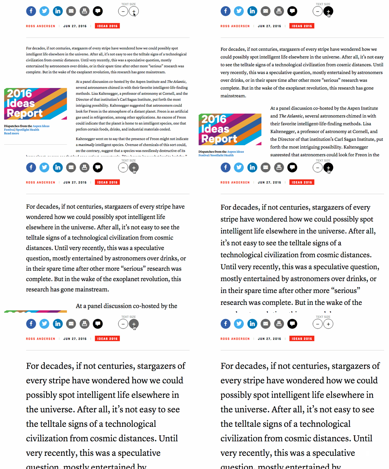
Sometimes, what your users need is a large size text. Now instead of relying on the zoom function which is notoriously famous for increasing the unnecessary time in the app session and spoiling the user experience, what our team of UI UX design agency & app designers, who excel in providing accessible app design for visually impaired suggests is giving a manual option to the users to adjust the font size of the text on the mobile application.
2. Use Alt Text for Images in Surplus
 A number of structural elements like images can be a difficult area for people with very low vision. Now what happens is that the visually impaired people generally use in-built screen readers present in mobile devices.
In the case of images, these screen readers read out the entered Alt text, hearing which users imagine what the image is portraying.
In that context, it becomes of prime importance that you use a very descriptive text explaining what is happening in the image instead of 4/5 words when you design for visually impaired.
3. Be Wary of Contrasts
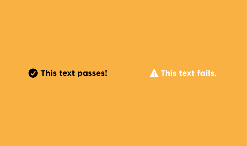
Deciding on a color combination can be one of the most difficult choices that you would have to make when designing mobile app accessible design app, especially for the color blind user segments. Now, instead of limiting yourself to a Black and White combination, there are a number of other pairings you can use to show the difference in background and the front element or any two elements.
When deciding on the contrast, you should ensure that the contrast ratio is at least 4:5:1 between the text and background.
Also, there are some clear combinations that you should avoid at all costs to ensure that your apps for visual impairment users or color blind users is not a nightmare session.
- Green & Red
- Light Green & Yellow
- Blue & Purple
- Green & Brown
- Green & Blue
- Green & Black
- Green & Grey
- Blue & Grey
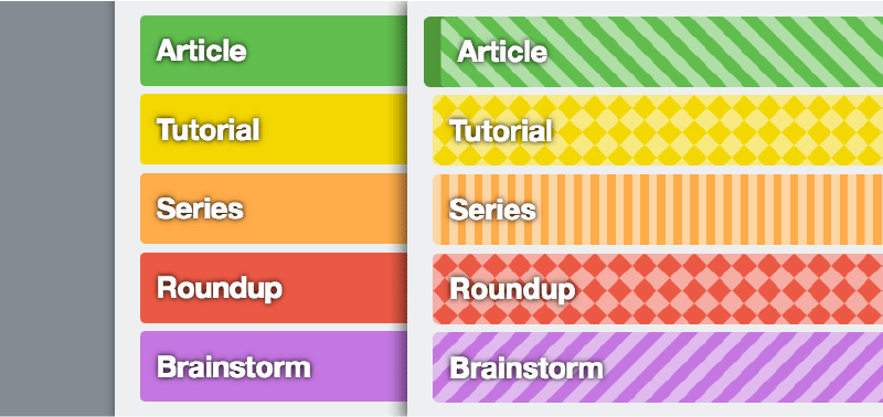
4. Make Textures Your Friend
While the majority of your visually impaired users would have a problem with identifying the different color shades in the mobile application, using textures in place of colors to differentiate one element from another will help solve your purpose while helping your users have a memorable experience within your application.
In fact, it is not just about user interface for visually impaired app users who would appreciate the usage of textures but also about all the other users whose usage of different textures can be very appealing, design wise.
5. Refrain From Using Just Colours to Give Out Information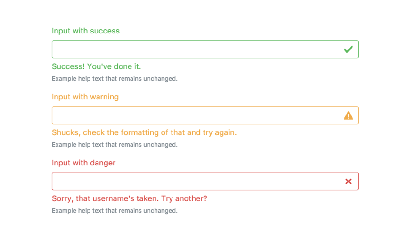
Red means danger or bad or something related to incorrectness, green is good, positive, and right—we assume this is a universal truth. But for the ones who are visually impaired or colorblind, it can be difficult to detect color changes on the screen. Thus it is advised no to depend on color alone to convey messaging.
Haven’t we all experienced the time when we fill in a form and accidentally put in the wrong information which makes the box turn red? While the whole situation has been in-built in our digital journey, imagine someone who has difficulty understanding colors and they have to face the situation. Imagine how they would struggle not knowing what they are doing wrong simply because they can’t see a red margin box on the screen.
The solution to this dilemma is pretty simple and even aesthetically alluring – using icons, vibrations, and text to show every right and wrong action taken by the user within the application.
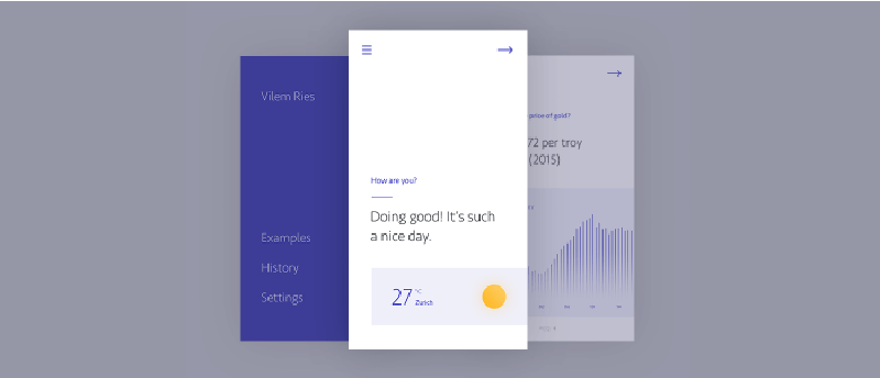
6. Make Minimalism Your Mobile Accessibility Apps Design Principle
Whether you are making Android accessibility app or one for iPhone, if there is one element that can make your mobile app a visually impaired user’s magnet it is Minimalism. The secret that revolves around giving the most minimum to the users design-wise, has a two-fold benefit –
A. The visually impaired app users have a memorable experience and
B. Your visually strong users will also love working around the white space in the application.
7. Make Dark Mode Your Companion
This one element would come in most handy when you have a lot of texts in your mobile app. The low vision users will find it much easier to read the content in the Dark Mode as opposed to the Light mode on your app.
A thing to note here is that if you are making Android accessibility apps for visual impairment, you will have to implement the dark mode design. But if you are developing an accessibility app for iOS, you will ensure that your team of developers is working on an app that is compatible with the Smart Invert Colours feature.
Now that we have looked at the different ways you can design mobile accessibility apps for visual impairment or low vision users or those with any other form of visual impairment, it is time to summarize it all in a form of mobile app accessibility guidelines checklist.
Well, here it goes –
Accessibility Guidelines for Mobile Apps – Checklist
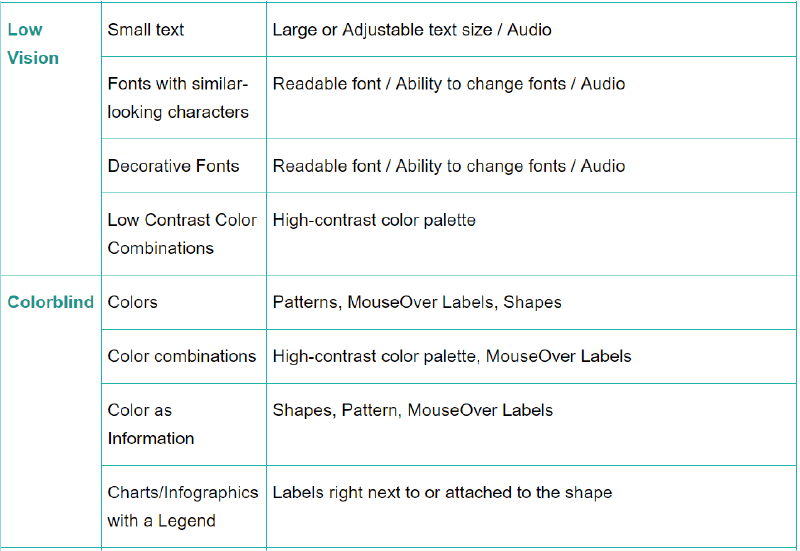
With this, you are now prepared to make your mobile app an accessibility app and there is just one thing left to do before you launch the app in the market and get the attention of those millions of users who were not able to enjoy your app yet – Accessibility Testing.
What is Accessibility Testing?
The process of testing whether or not your efforts to make your mobile app accessible design right for low-vision users was successful is what defines accessibility testing for UI design for visually impaired app users.
As you are making mobile app accessibility guidelines refinements, you can make use of the accessibility scanner app available on the Play Store. But what our experience tells us is that mobile app accessibility testing on UI design for visually impaired users is more often than not incomplete until you take your application to real users. While the accessibility testing tools for mobile development can come in handy, you can never be too sure.
Also, instead of waiting for your whole accessibility app development process to end, conduct mobile app accessibility testing at every stage to prevent yourself from going too down in the wrong way.
Navigation, Multiple browser design, and perceivable content are just a few things that you will have to prepare your application for to ensure that ALL the users who visit your app, irrespective of whether they have a 20/20 vision or are colorblind, have a great experience.
Parting Thoughts
Now that you have seen it all, there is just one thing left to do – shed the misassumption that these accessibility refinements in your mobile app will only attend to the low-vision users and understand that they will benefit all – as ALL your users will be able to have an easy on the eye experience in the application.
Well, there you go. You are now ready to launch your accessibility app in the market and reach all the users who are unconsciously left behind.
If you need help with the app design company or want advice from a UI UX design company in USA, then feel free to contact us here, and we are happy to help you with your doubts and questions.

strategies your digital product..
