The chatbot that would revolutionize budget management for millennials.
Transformation of the manual nature of financial budget management process needed an Artificial Intelligence solution. A solution that ABC offers.
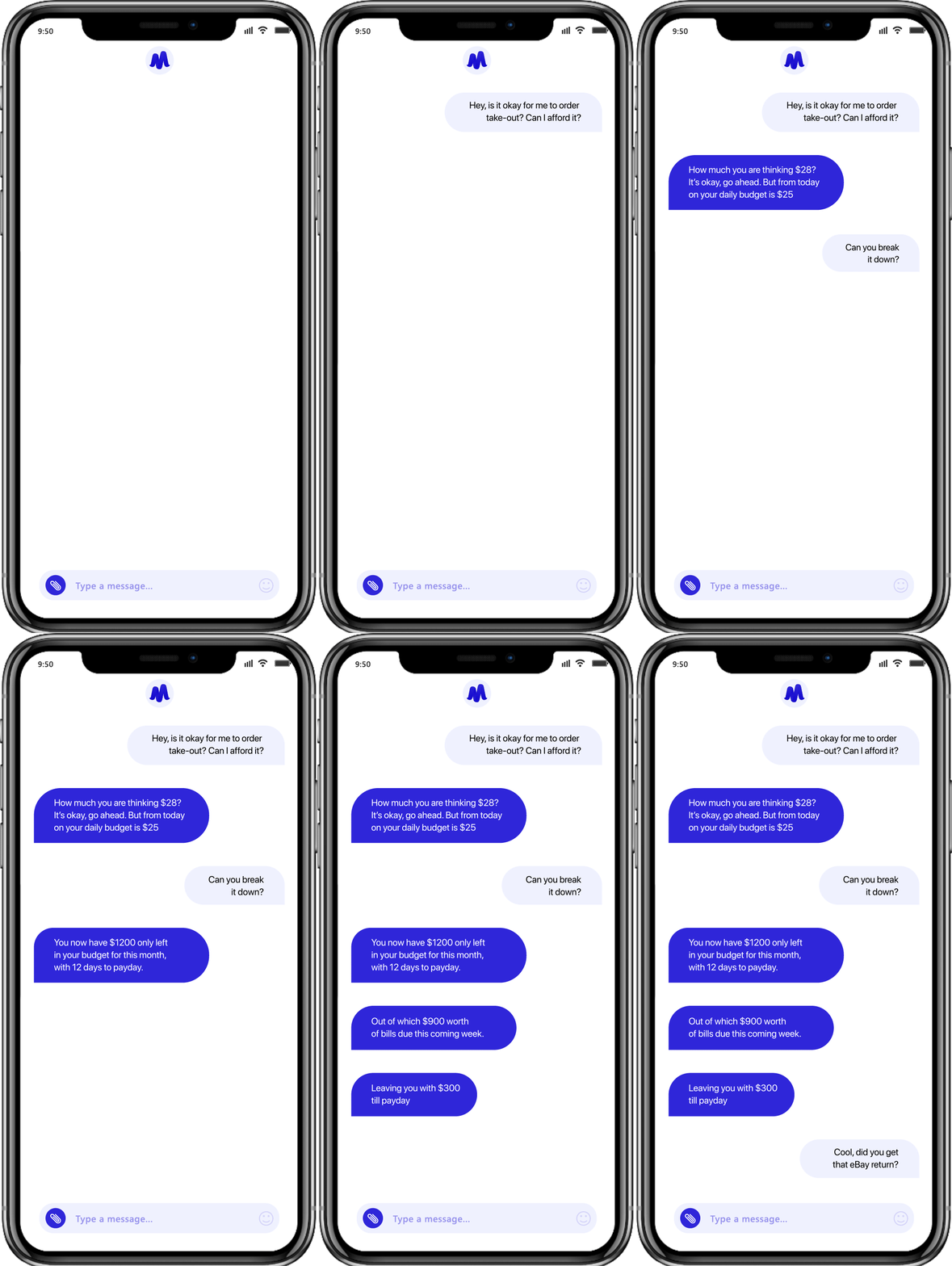
The application is a chatbot centric budget management solution, which keeps tab on the expenses that a user makes and informs them when their budget gets out of hand. The pun and games coated solution is devised to make financial matters interactive and fun for the millennial user base who gets bored easily.
The challenges that marked the need to make budgeting intelligent.
Finance industry has since the early age been working under the tag of being a no-nonsense, serious sector. While, this directness is something that has been appreciated by the Generation X, Generation Y or the social generation has always seeked innovation, speediness, and fun in every sector, with Finance domain being no exception.
With the millennials now becoming the most active contributors of the economy and with the TechFin era slowly getting mainstream, financial processes too need a revival. Budget, is one such financial process that has historically been done manually on pen and paper, which came with a stringed dependency on proper storage and filing of bills and receipts.
It was time to change the budgeting process and automate the otherwise manual task. It was also equally important to add interactive and fun elements in the process, especially because budget planning process in itself lacks interesting moments, which could hook the spenders to become better financially planned.
When the client came to us, they were sure that they wanted a solution around Artificial Intelligence. Their aim was clear - to deliver a mobile solution that would focus on making budgeting a financial process that didn’t need users’ constant attention and time.
At the same time, they were struggling with finding ways
to make the process interactive and fun for the millennial
user base who consider finance related tasks a drag.
The solution that our business analysts and Fintech experts gave them
was that of a chatbot based mobile application which would help users
manage their expenses through an interactive, puns and games filled dialogue.
The chatbot centric app had to be designed in a way that the process would appear life easing and fun for the end users, while ensuring that it isn’t intrusive or creepily personal. Every design element had to be chosen in a way that the users would have the provision to have a quick in and out experience and simultaneously have enough elements to interact with in case of long session time.
The design module was a result of the complete understanding of the user persona of consumers who would use the application: the issues they must be facing in the traditional budgeting method, the solution they would be looking for, and the end result they must be willing to achieve.
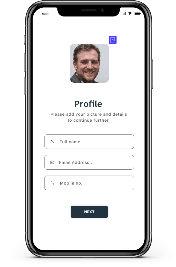
The understanding of user persona helped us create a rough wireframe of how the users would move in the application. It helped us identify the features’ placement which would be in the view but at the same time would let the focus be on the main element of the app - the AI chatbot.
The elements that were to get incorporated in the application were decided upon with minimalism acting as the ruling formula. Every part of the design that the users would interact with had to be chosen to support a non-mundane experience. Everything from the colour code choice to the type of micro-interactions and font styles was chosen to show an unconventional side of the fintech sector.
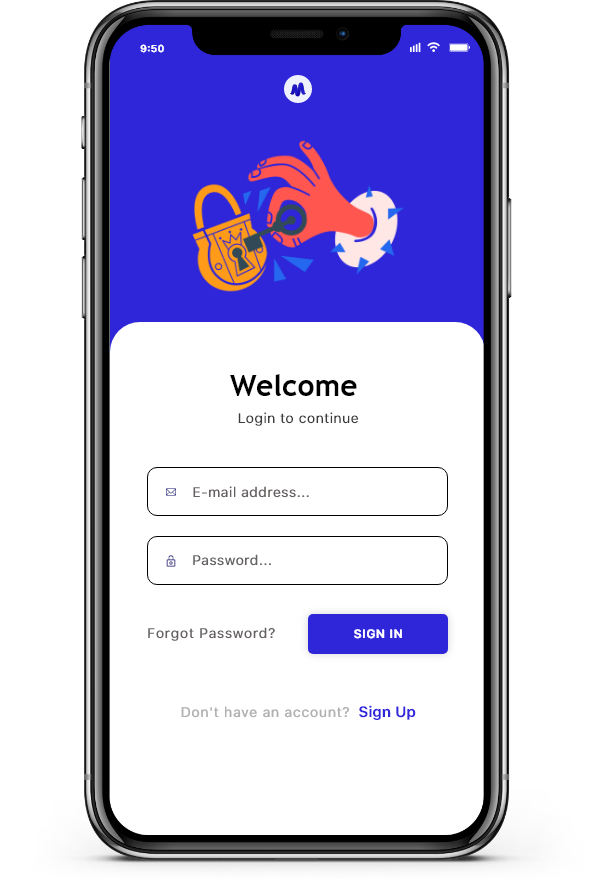
We applied a mix of clarifying and interactive icon in the app’s UI design. The intent behind the choice was to make the touchpoints and next steps easy to follow through.
Our choice of colour code combination was driven by the intent to make the app engaging and millennial centric. We went with bold colours to define the app setup.
To gather the interest of visually inclined user base, we kept illustration sketches as an important app design element. Like the colours and typography, the illustration set was also set in a bold and eye catchy tone.
Noting the user persona, we went with a modern textual layout, which was easy to interact in, while giving the user an un-interfered experience.
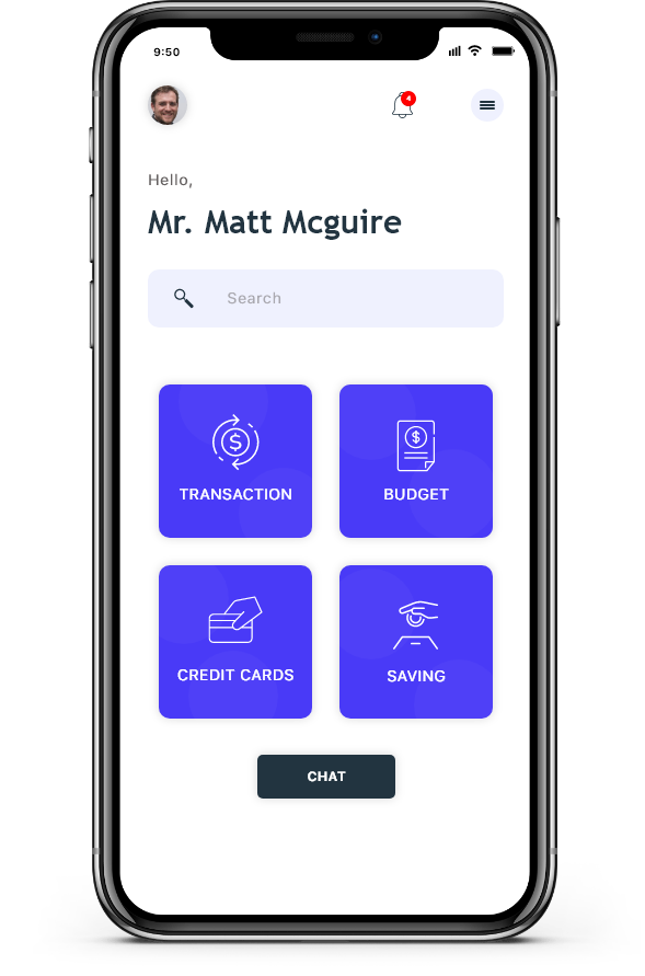
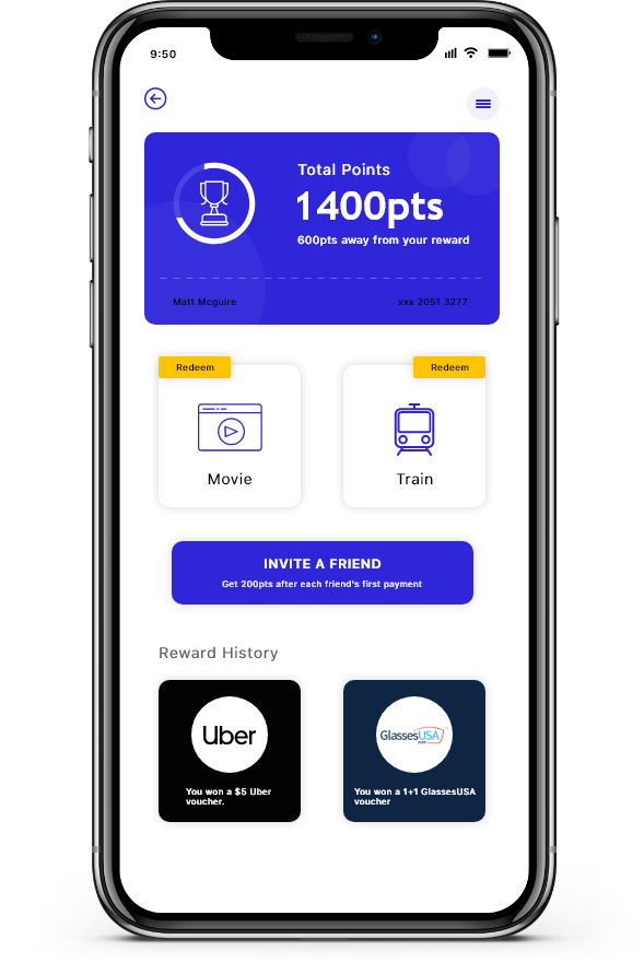
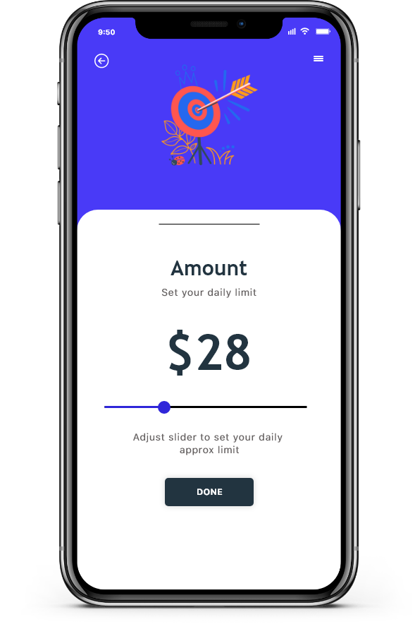
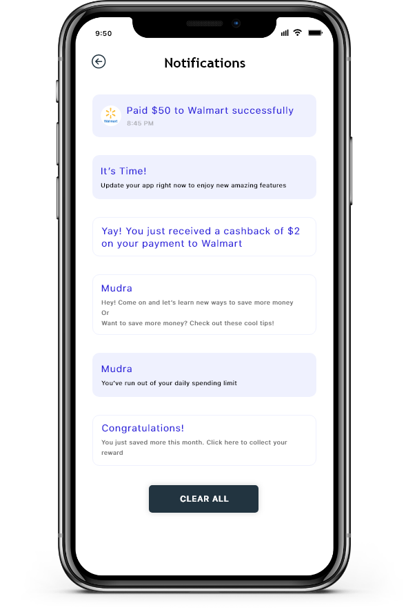
The division and development of the AI powered chatbot started with deciding upon closed and open system bot. Since the intent of the application was only centered around budget management, we decided to go with a closed system bot development, which would fetch users’ financial information through their debit and credit card history to then interact with them.
With the decision of the base now frozen, we went on to formulate interactions on Google’s Dialogflow Fulfillment which sends dynamic responses to the end users. Since the application was purely text based, we chose to go with Google Dialogflow in place of Amazon’s Lex chatbot, which is primarily voice based.
It was time to change the budgeting process and automate the otherwise manual task. It was also equally important to add interactive and fun elements in the process, especially because budget planning process in itself lacks interesting moments, which could hook the spenders to become better financially planned.
Although the application was mainly centered around the creation of a chatbot,
there were some inherent challenges that showed up during the process.
We had to identify the information that we would fetch to feed into the Dialogflow
and the process we would follow to do that to ensure the security of the data.
There were two options in front of us: Either fetch the information through emails
or messages that the users received or ask them to fill in the details manually.
We wanted the chatbot to interact beyond fixed yes/no responses and since the app idea was focused on millennials, it had to be full of puns and insults. So, the next challenge for us was to create dynamic responses.
The last challenge that our team of developers struggled with was in terms of Dialogflow. Since, the framework does not offer an API for frontend, it was very difficult to send the gathered data to the Dialogflow backend for processing.
The 6 months of our design and developmental efforts resulted into a chatbot application that is ready to be launched in over 12+ countries globally. It is packaged with all the interactive elements that are poised to make it an engagement magnet and a Fintech industry revolution.
